Task one – Research
Ubisoft
Ubisoft Entertainment SA (formerly known as Ubi Soft Entertainment SA) is a French games company headquartered in Montreuil, France. The company was founded on 28th March 1986 and was known as its former name from its founding date until 2003. The company is most well known for their games Assassins Creed, Fare Cry, Just Dance, Prince of Persia, Rayman, Raving Rabbids and Tom Clancy’s. Most of these games, Assassins Creed especially, is well known both inside and outside the gaming community as one of Ubisofts longest running franchises, the first game being released in 2003 as “Prince of Persia: The Sands of Time”. The “Prince of Persia” games have often been referred to as spiritual predecessors to the Assassin’s Creed franchise as their mechanics are rather similar.
Ubisoft’s games are normally quite based in realism, normally having history worked into them. Prince of Persia and Assassin’s Creed are perfect examples of this being based around historical Persia and the history around the crusade. The mains antagonist group from Assassin’s Creed, the Knights Templar and the assassins themselves are based on real groups but the groups they are based on never actually co-existed in the same time frame.
The company is run by Yves Guillemot, (CEO and co-founder), Alain Corre (EMEA Executive Director), Christine Burgess-Quemard (Worldwide Studios Executive Director), Serge Hascoet (Chief Creative Officer) and Laurent Detoc (NCSA Executive Director). The CEO is one of the original 5 brothers that founded the Ubi Soft Entertainment SA company.
In the financial year of 2019, which ended in March, Ubisoft reported their net income to be 99.99 million euros, less than their previous year, when they reported their income to be 139.45 million euros.
Visual elements and principles
Elements
Line – Analyse for weight, smoothness, direction and tone.
Colour – Analyse for emotion, highlights, meaning and emphasis.
Light – Analyse for highlights, emotion, clarity, accuracy and shadow.
Shape – Analyse for construction, guides, structure, smoothness, symmetry, angles, silhouette and form.
Space – Analyse for positive and negative space, black and white, comfort, weight and proportion.
Form – Analyse for shading, structure, weight, hierarchy and accuracy.
Texture – Analyse for accuracy, smoothness, hardness, detail and effect.
Principles
Balance – Analyse for harmony, appropriateness, weight, proportion, resolution and comfort.
Proportion – Analyse for dimensions, scale, ratio, accuracy, relationship and perspective.
Emphasis – Analyse for contrast, highlight, importance, emotion, context, scale and colour.
Movement – Analyse for method, direction, orientation, emotion, power and force.
Contrast – Analyse for direction, colour light shadow, focus, attention, space and form.
Unity – Analyse for pattern, scale, dimensions, emotion, colour, shape and alignment.
Pattern – Analyse for colour, repetition, power, direction, complexity and shape.
Robot analysis
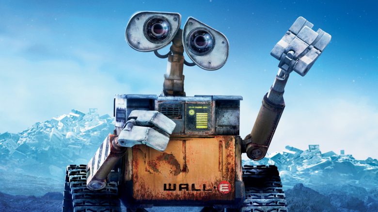
WALL-E
WALL-E, 2008
When looking at this image I have of WALL-E, the first thing I look at is his eyes as human instinct tells me to look at his eyes to tell if he is a threat or not. Looking down WALL-E, you can see he is simple in shape but looking closer, you see the details about him. His shape is boxy and simple, being made from shapes like cubes, cylinders and squares but looking at his hands for example, they are made of more complex polygons.
The texture of the robot is obviously rough and rugged, not being cared for and rusted as he has been alone on the planet for years alone with no maintenance. He looks like what you expect from a robot left to work on a planet alone for years would look like. The background in the image is simplistic looking, looking like mountains but when you look closer, they are actually piles of rubbish, giving you an idea about what the movie is about.

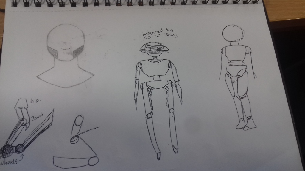
L3-37
Solo, 2018
When looking at L3-37, the first thing you notice is her humanoid shape. She is made of simple shapes but when looking more deeply into her, the complexity comes through. From the wires and piping connection her different parts together, to the detail on her body, you can tell that she is complex, even with her simple shape. The light behind her in the image gives another level of imposing to her, making her the center of attention and again showing her more complex parts.
From the image I’ve chosen, the proportion and angle of the camera makes her look huge compared to the human next to her. This makes her look imposing and forceful, making her seem like a strong character even without knowing her personality. The textures on her also show a little of her personality, she is smooth but rugged, cared for but willing to get in the way of something trying to attack the human she is most seen with. She is metallic but not shiny and new looking, she has age.

K2SO
Rogue One, 2016
The image I’ve chosen of K2SO makes him look incredibly imposing, putting him at the center of the screen and the center of attention. His scale is huge, even against the background image of the Death Star. The ships in the background look like they are tiny, giving him more power in the image. The colours of the image are very dark and cold, with blue tones and K2SO himself being black and dark greys. He also has a lot of detail on his body, cybernetic patterns in a deep blue covering most parts of his body. These could indicate him being different to other robots that are the same as him, being hacked and the cybernetic patterns being walls of code to prevent him turning back into what he was.
The shapes that create him are mostly simple with some complex shapes. The simple shapes mostly consist of cylinders and circles. The textures on him are also quite complex, possibly showing battle damage and previous repairs, as well as just general wear and tear you would expect on a working robot. The background is detailed in its own right but compared to K2SO in the foreground, it pales and looks simple.
My designs


Developed sketches
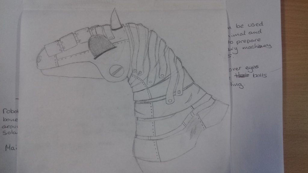

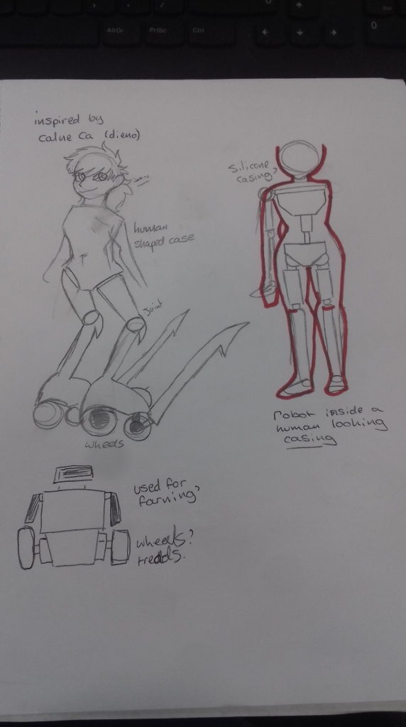
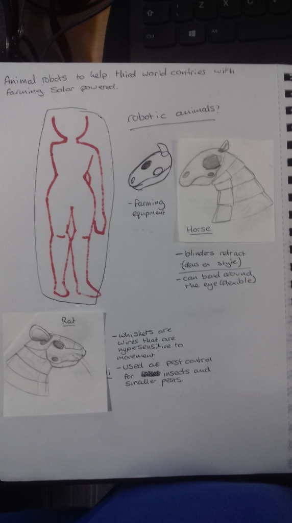
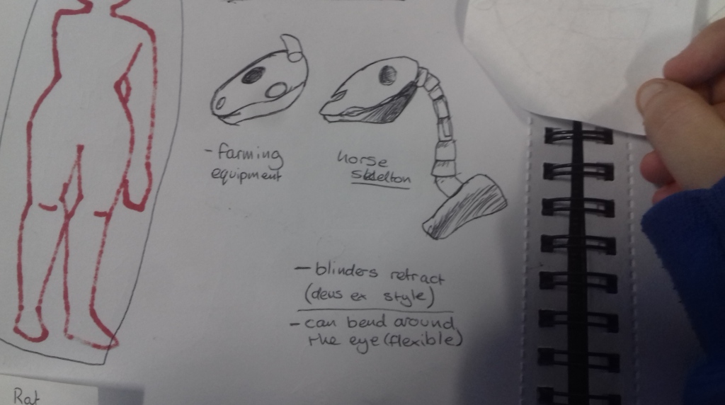
My first developed sketch was a horse robot I originally drew. The robot was inspired by Robert Chew, an artist who used to draw robotic animals with uses in a future version of the world. I imagine the horse robot I have designed could be used as a farm hand in struggling countries, pulling heavy machinery and transporting goods by cart. The robot is built off a real horse skeleton and is powered by rechargeable batteries, charged by solar panels built into the mechanics of the horse instead of being powered by expensive diesel and petrol producing more emissions. The robots also could help produce less harmful emissions, helping us slow down or stop global warming.

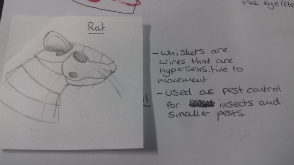
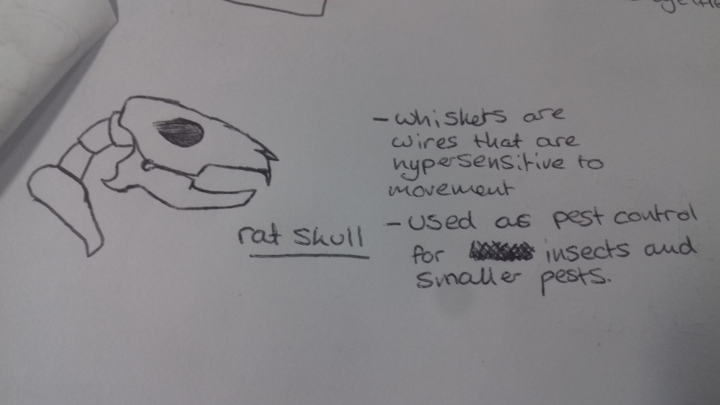
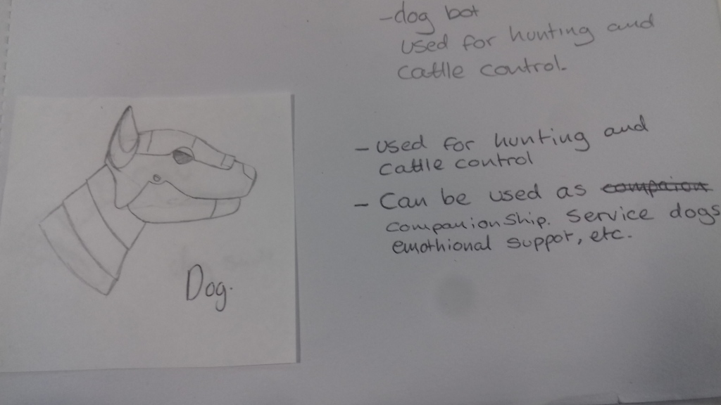
The rat robot I designed was again, inspired by Robert Chew. I imagine the robot rat could be used to control pest insects on farms, especially in barns and in storage tanks. The robot is again built onto the skeleton of a rat and uses rechargeable batteries powered by solar panels. The uses for the rat robot could also be as an emotional support animal, being used to support those with depression, anxiety, PTSD and other mental illnesses. The robot could be programmed to detect panic attacks and other phenomena relating to mental illnesses and could help with alerting medical professionals to come and help the person in question.
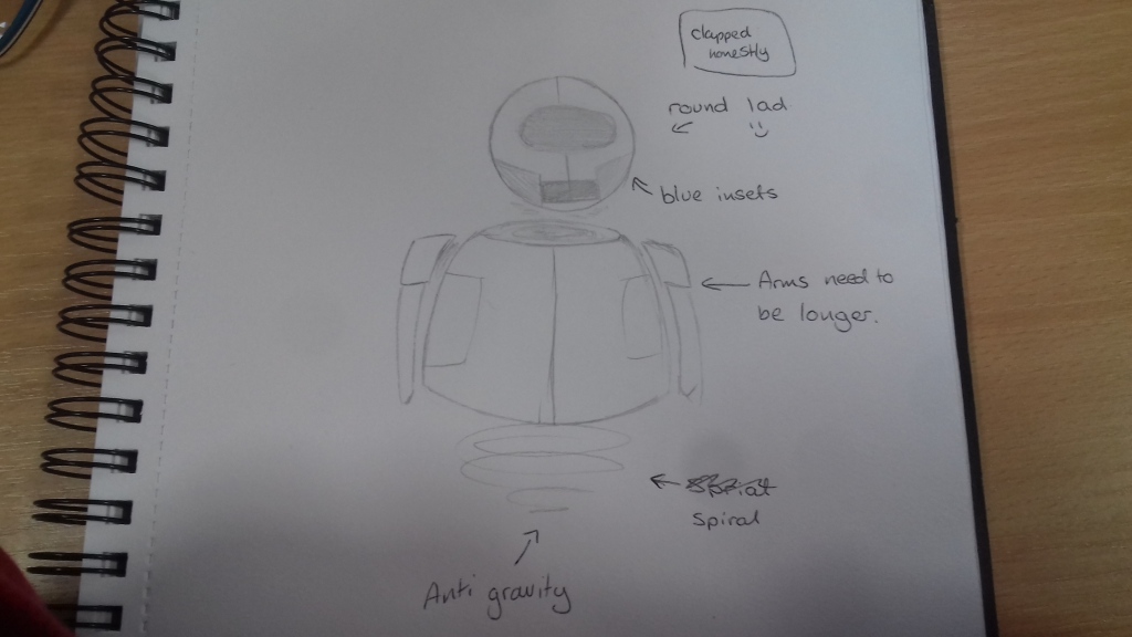
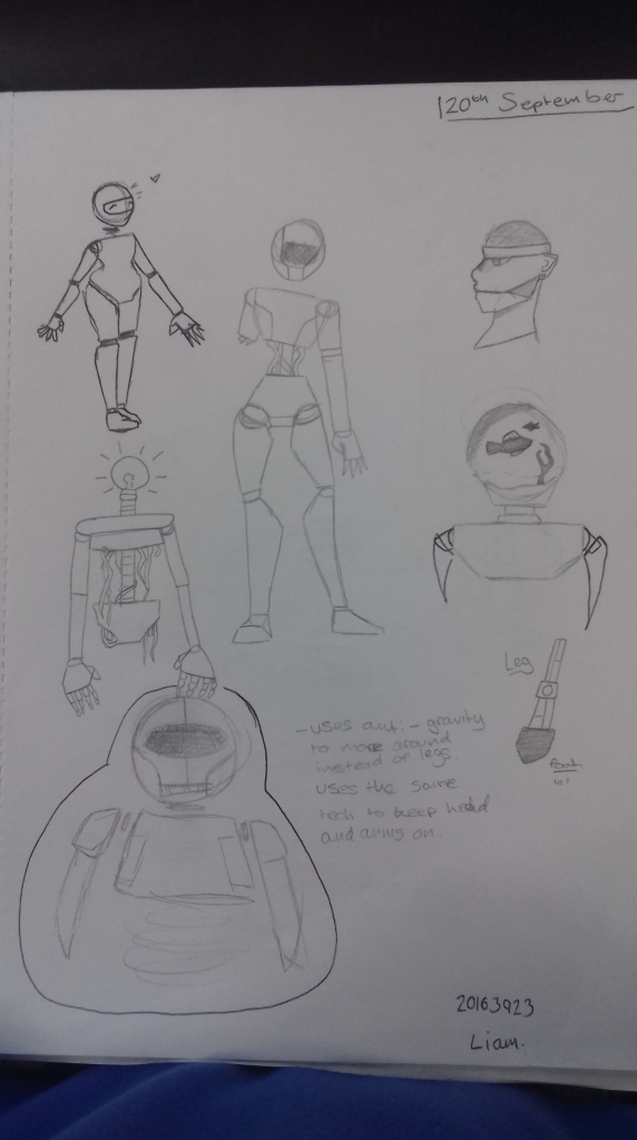
The last developed sketch I did was of a simplistic robot inspired by WALL-E. It is inspired by parts of both WALL-E and EVE as robots, the face and arms inspired more by EVE and the simple boxy body being inspired by WALL-E. The robot itself uses anti-gravity forces to stay up and uses forces to keep it’s arms and legs on. I chose this design because, considering my limited skills in 3DS max, it was the easiest robot to create in the program.

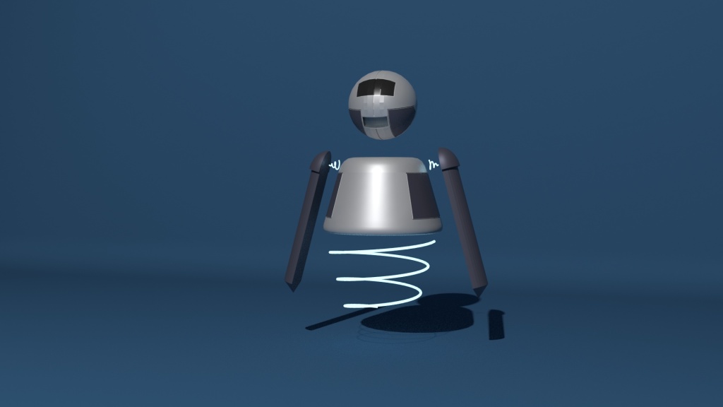
This is my final orthographic and final render of my robot. I chose this design as it was the simplest robot design I had and considering my lack of skills in 3DS max, it was the easiest to make with my beginner knowledge. The robot design is inspired by the movie WALL-e, particularly by the robots from the movie, WALL-E and EVE. The boxy, simple shape of the robot is inspired by WALL-E while the simple colours and rounded edges are based on EVE. The texture of the robot is very smooth and futuristic, the colours being significant as well. Blue is often seen as very futuristic and sci-fi. He is simplistic in shape, with more complex details if you look closer (the line around his head, the indented cheek plates, etc)
Harvard references
Amazon. (2019). 71RSKVEqp1L._SY606_. Available: https://images-na.ssl-images-amazon.com/images/I/71RSKVEqp1L._SY606_.jpg. Last accessed 09/10/19.
Exploreyork. (2019). 16-9-WELL.E-780×439. Available: https://www.exploreyork.org.uk/wp-content/uploads/2019/06/16-9-WELL.E-780×439.jpg. Last accessed 09/10/19.
Imgix. (2019). 62c5cfcd-5d89-42ad-a7ed-aaef6216699f-hs-ff-002775_de827e2a. Available: https://imgix.bustle.com/uploads/image/2018/5/22/62c5cfcd-5d89-42ad-a7ed-aaef6216699f-hs-ff-002775_de827e2a.jpeg?w=970&h=546&fit=crop&crop=faces&auto=format&q=70. Last accessed 09/10/19.
